UI DESIGN FOR MICROSITE, USER EXPERIENCE
Presenting the best in travel for Lonely Planet’s travel curious audience
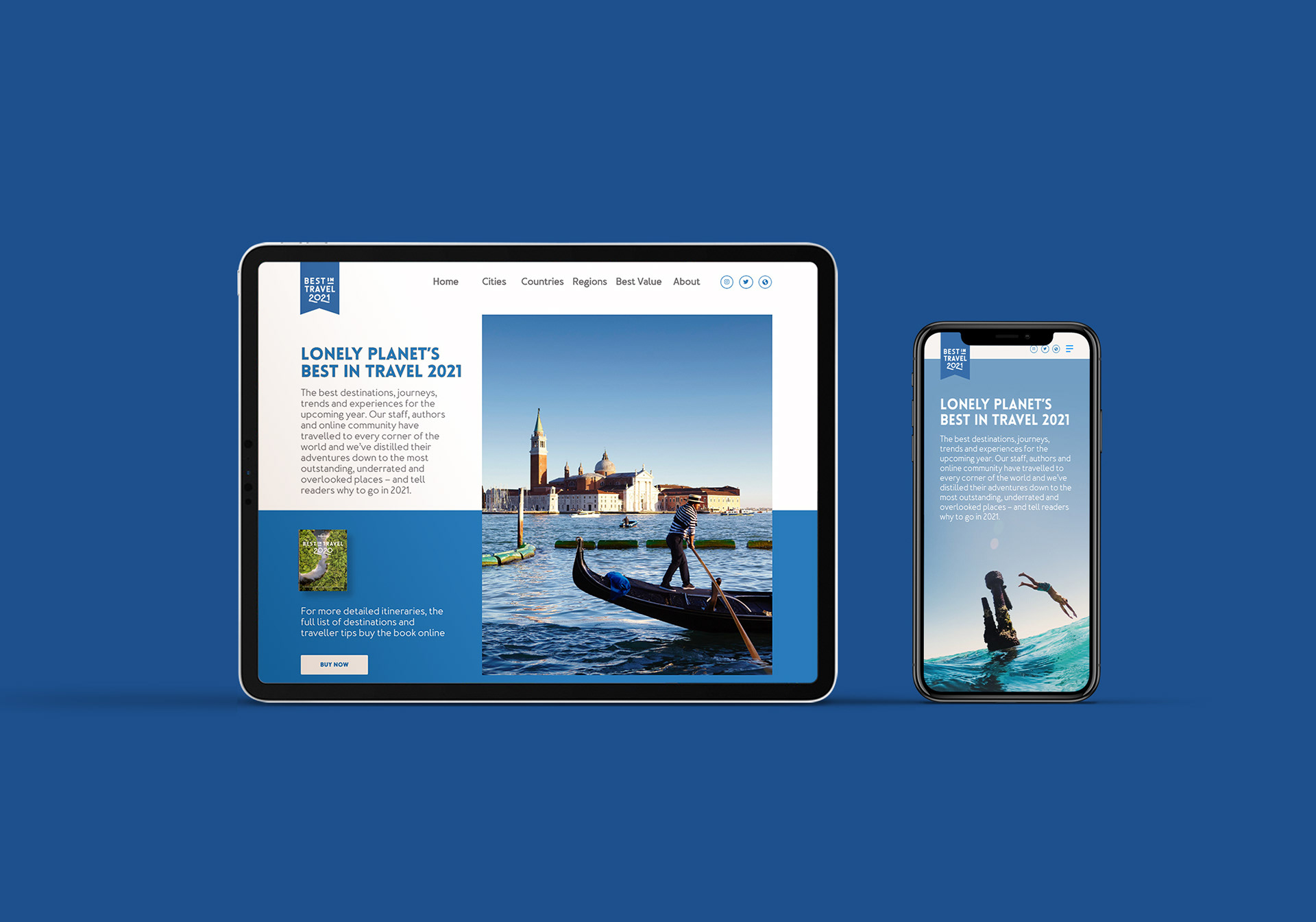
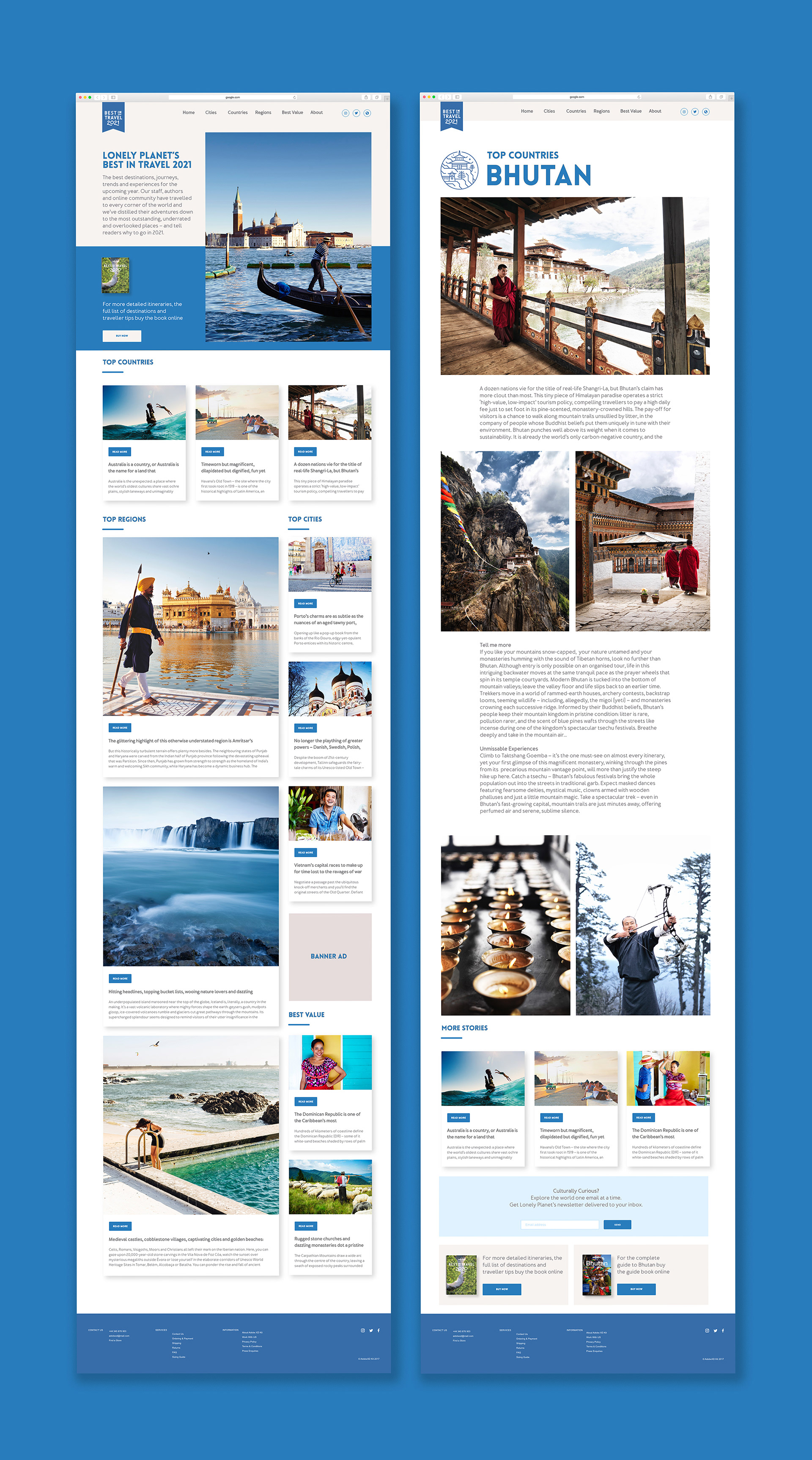
Best in Travel is Lonely Planet’s yearly roundup of the best destinations, journeys, trends and experiences for the upcoming year. The content is picked by staff, travel writers and an online community who have travelled to every corner of the world and distilled their adventures down to the most outstanding, underrated and overlooked places.
Lonely Planet required an online presence away from their main website to complement the book, so I designed a Best in Travel microsite. The aim was to promote Best in Travel as a brand in itself to an online audience, and to drive sales of the printed edition as well as individual destination guides. The microsite design mirrored the book, with ‘sneak peek’ curated articles incorporating original brand-authored content. I designed the site to accommodate a broad range of content formats, increased the visual impact of the photography, and structured the home page into thematic sections, with links to related content. It was essential to maintain the authoritative and fun style of the Lonely Planet brand. The site was designed using Adobe XD I ensured the layouts were attractive and responsive for all types of digital devices, working seamlessly to create a enjoyable user experience.
Client: Lonely Planet